Sparx PG
Shop Redesign
Overview
I completed this project while receiving feedback for revisions from the design team, VP and CEO of Sparx Publishing group. This redesign of their shop was one of my two projects I completed for Sparx during the time of my 2-month practicum with them. The shop was already in decent shape. My task was to discover where improvements were needed and to propose the necessary design changes while holding the integrity of their style guide.
My Role
Project Dates
- Start: April 2022
- End: May 2022
Project Tools
- Figma
- Adobe Illustrator
The Challenge
The challenge I took on for this project was that being my first one in the industry outside of school, having redesign their currently live shop which already had a simple, attractive design. It was noted between myself and the company that some components were dated and needed a refresh, but I needed to go beyond that and create something new while backing my decisions and thought processes through research and collected data.
The Solution
The solution was to apply my knowledge and skill sets from previous projects and school to create the redesign. This knowledge consisting of conducting usability testing on the current shop to identify what may need changes. The next part would be to create a wireframe based on my findings, while conducting usability testing again for quality assurance of the design. Finally, putting everything together into the final prototype and presenting it to the VP and CEO for feedback and make revisions. In the end, creating a new, data driven, modern redesign for Sparx’s online shop.
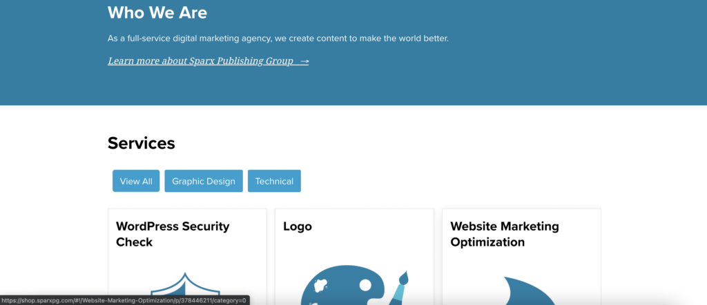
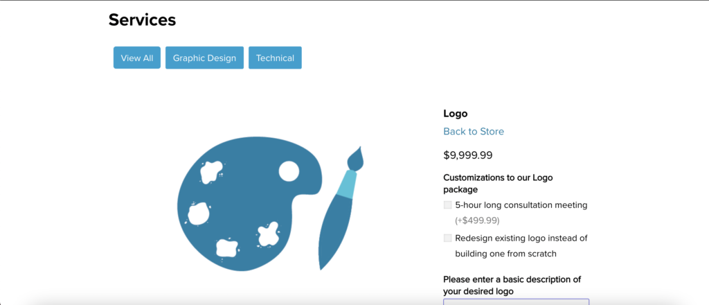
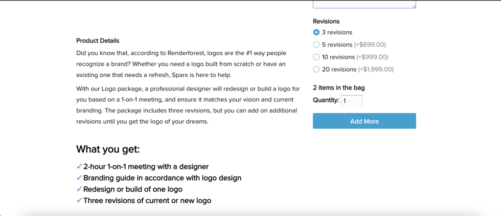
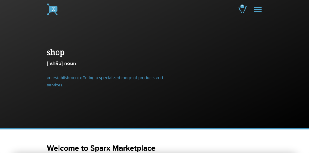
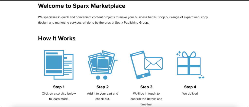
Current Shop Before Redesign


Usability Testing
The initial step to the redesign was to conduct usability testing on their current shop to identify any key issues and pain points from the shops home page, to shop check-out. The 4 testers varied in age from 21-55, various occupations and genders.
I conducted screening, in-test and post-test questions.
A few questions asked:
Whats is your age, occupation and level of formal education?
How much time do you spend on the internet a week?
- At first look, what do you expect you can find in this shop? How do you feel about the overall design?
Does anything seem irrelevant or dated?
- Task: Suppose your’e looking to purchase a service for a completely new logo design, what steps would you take?
- If there was one thing you could change about the shop, what would it be?
- If there is one thing you enjoyed about what shop, what was it?
Discoveries:
- 3/4 testers expected to see physical products in the shop. However, the shop sells services.
3/4 testers suggested having their “how it works section” from the shop home page on the selected service page as well.
3/4 testers made note of some of the icons being used for the how it works section or services offered needed a visual update to flow better with the company theme.
2/4 testers were under the impression they had to select a non-mandatory add-on for a longer consultation to make a new logo order.
- 0/4 testers had an issue with the final checkout/payment making page.
Wireframes
The first step i took at redesigning the shop was creating multiple versions of wireframes. I knew the core focus here was an improvement of hierarchy as well as adding “how it works” sections to a service selected.
Service Selected with open menus - Mobile

Shop home - Desktop
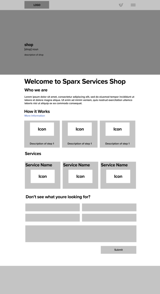
Service selected - Desktop
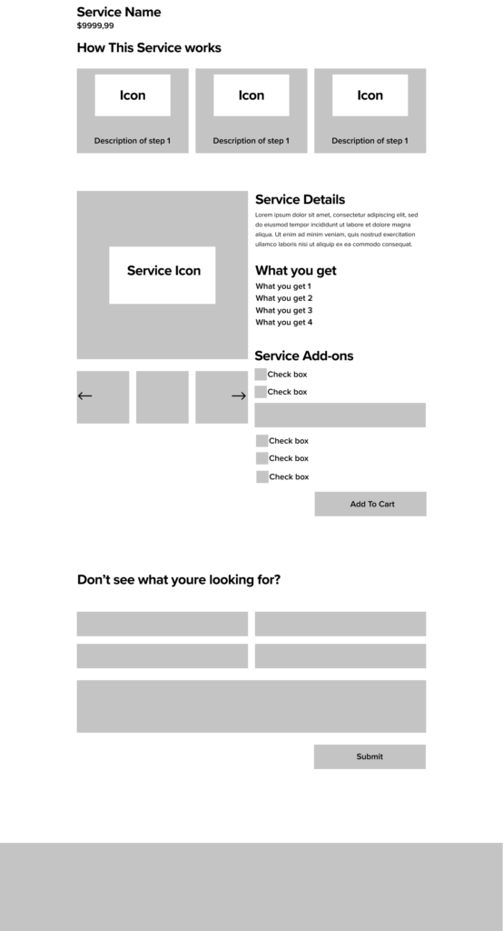
Shop Home - Mobile

Service Selected - Mobile

Service Selected with open menus - Mobile

Shop home - Desktop

Service selected - Desktop

Shop Home - Mobile

Service Selected - Mobile

Service Selected with open menus - Mobile

Icon and Card Updates
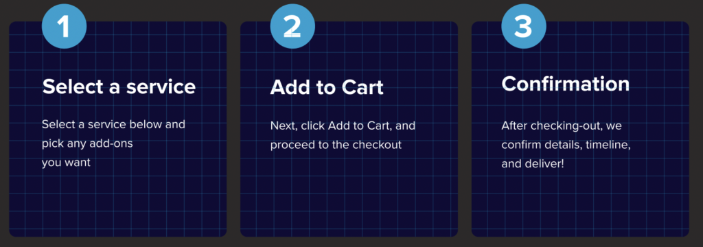
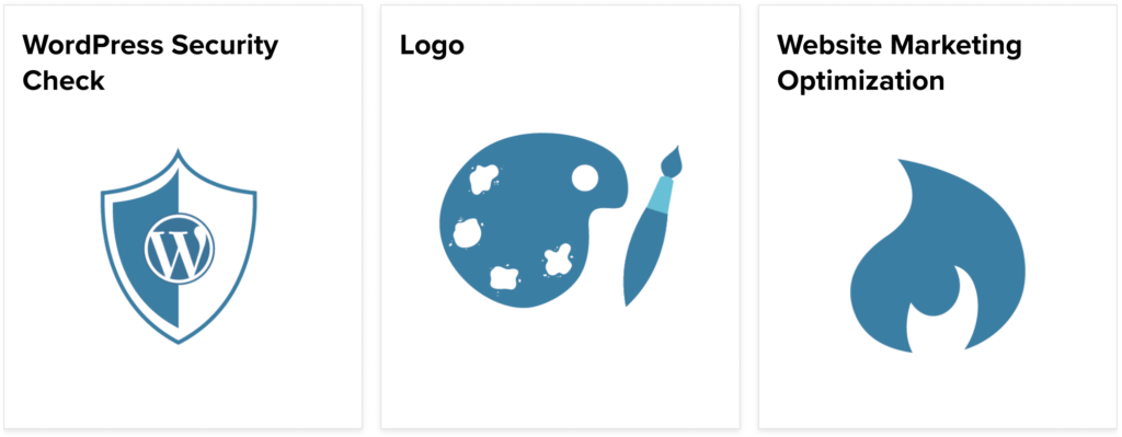
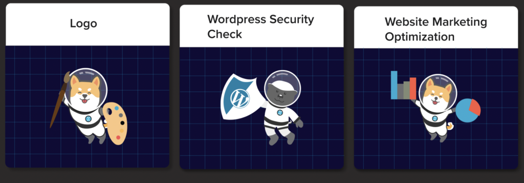
Next, I needed to modernize the cards used for their “how it works” section as well as the icons for their shops services.
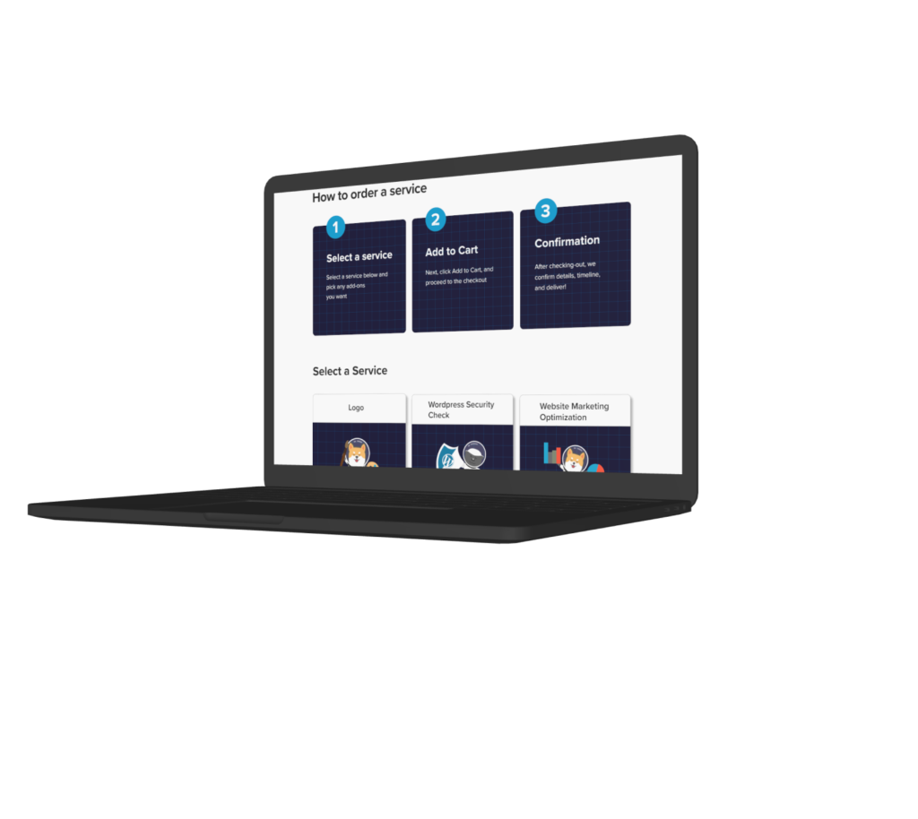
I decided to use no icons for the how it works and keep it as a text only card with optimal readability while using their grid design for consistency.
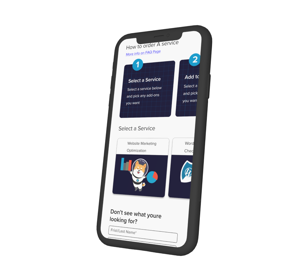
For the services button cards, I decided to use the company mascot illustrations and add to them to fit the topic of the service. For example, the Shiba Inu is holding a paint brush for logo, and the badger is holding a WordPress shield for WordPress security. This tied together the service offered with the company branding.
How it works: Before Redesign
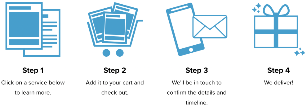
How it works: After Redesign
Service card buttons: Before Redesign
Service card buttons: After Redesign
Final Discoveries Before Prototype
While receiving feedback from the Sparx design team, VP and CEO, I discovered some major flaws in my wireframe.
- The use of a larger card for how it works and services creates too much vertical scrolling on mobile devices.
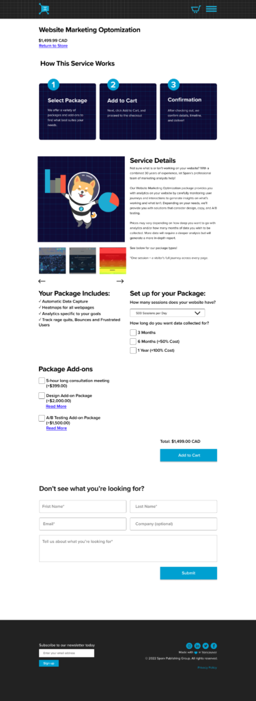
- Once service was selected, there were still issues with hierarchy, leaving the user confused as what action to take next.
Solutions:
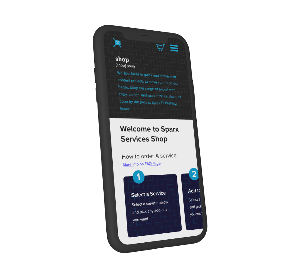
- Implement a horizontal scroll to browse the cards for mobile devices.
- Improve use of headers and language used to guide the user more efficiently.
Prototype Frames
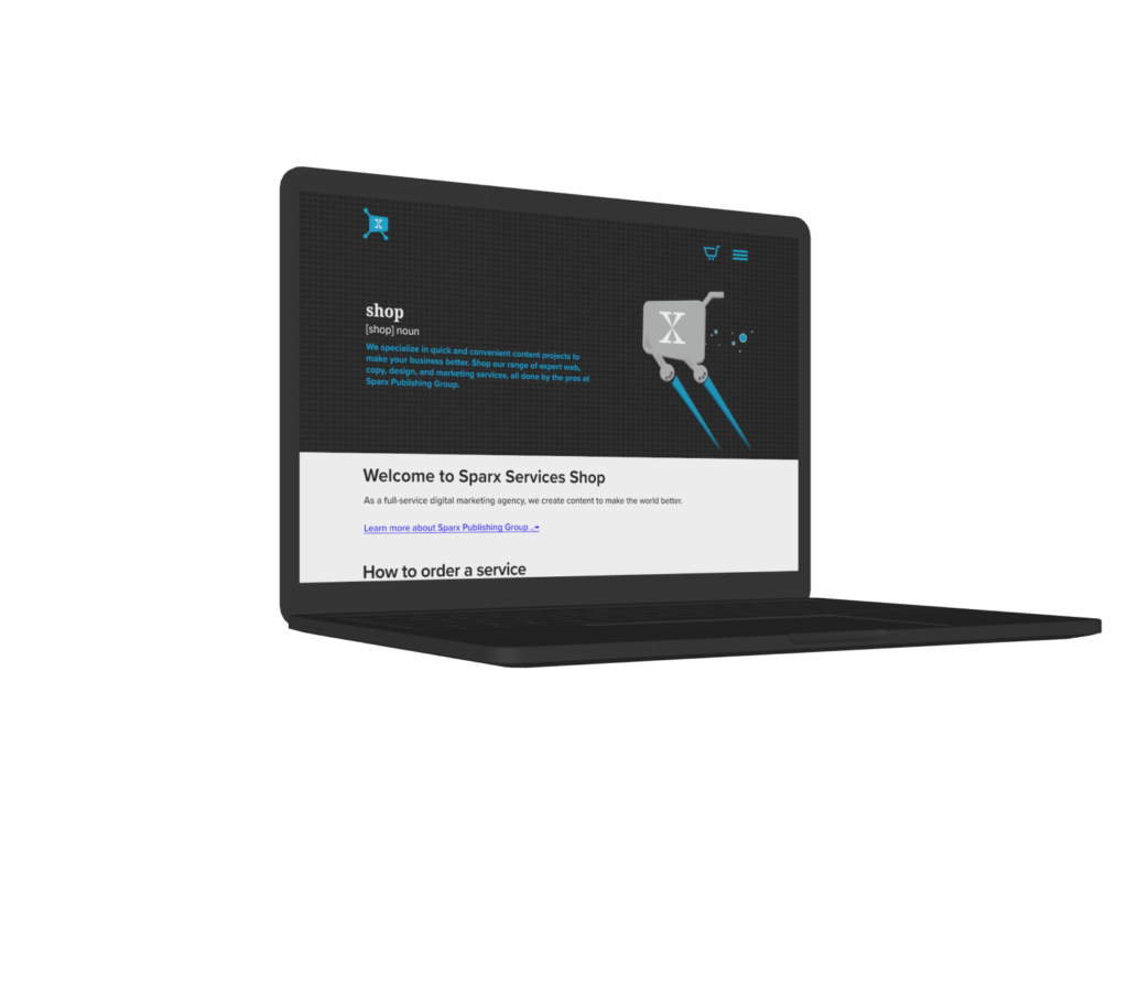
Shop home - Desktop
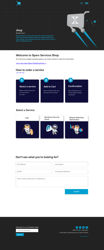
Service selected - Desktop
Shop home - Mobile

Service selected - Mobile

Shop home - Desktop

Service selected - Desktop

Shop home - Mobile

Service selected - Mobile

