This was a collaborative school project created by 3 Designers and 3 developers. We chose to design and develop a mobile application for users and a desktop application for the clinics. The purpose of the application is for patients to book appointments at walk in clinics and to connect with available family doctors. The clinic can manage bookings as well as patient and doctor profile lists.
My Role
As UI and UX Designer as my primary role, I was responsible for:
Researching and surveying people to collect data to identify key issues in our current healthcare system
Creating primary and secondary user personas
Creating user flows
Creating low, medium and high fidelity prototypes with wire-framing
Conducting usability testing on each fidelity and implementing found data
As Front-end Developer as my secondary role, I was responsible for:
Developing components with functions
Developing page layouts
Entering and maintaining data in Firebase
Project Dates
Start: September 2021
End: December 2021
Project Tools
Figma
Adobe Illustrator
Asana
VS Code
Guthub
XCode
NextJs
React/React Native
Firebase
Figma
Adobe Illustrator
Asana
VS Code
Guthub
XCode
NextJs
React/React Native
Firebase
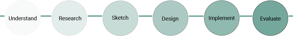
Design Process
Problems in the Canadian medical system
According to a survey from Statista, the top three health-care issues for Canadians are:
43%
Wait times
14%
Availability/Accessibility
13%
Shortage of doctors
Upon user research, this app was created based off of a common problem In the Lower Mainland of British Columbia. Patients struggling to get into walk-in clinics and finding a family doctor due to high or unknown wait times. Another common problem we discovered was patients being uncomfortable with English as their second language and having difficulty finding a family doctor who knows their native language.
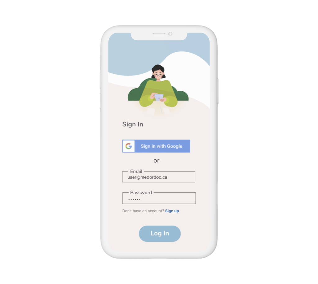
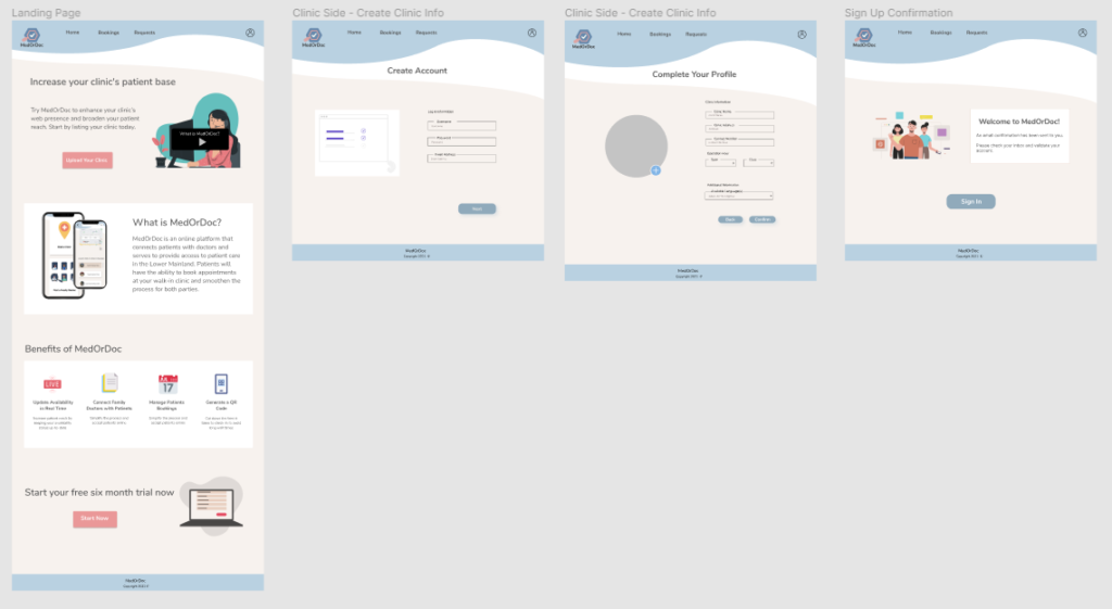
The Solution
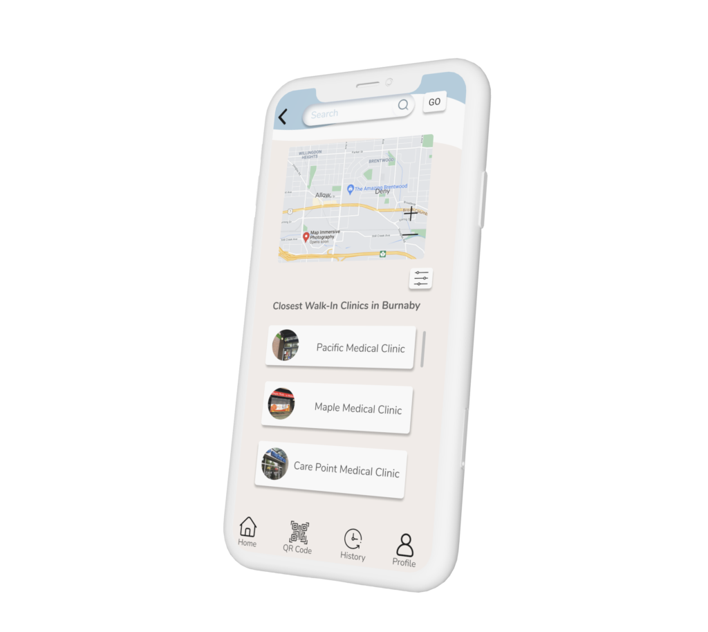
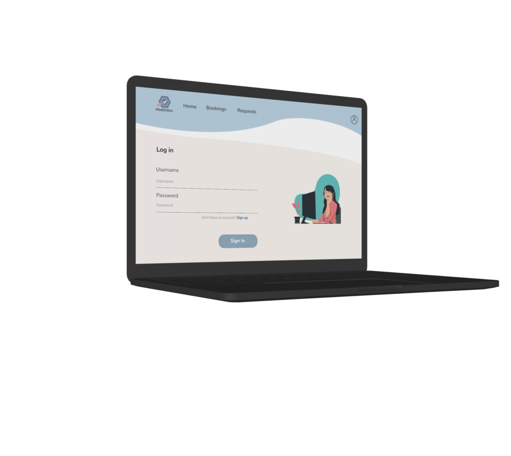
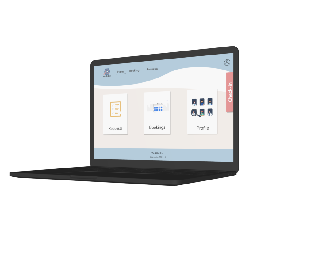
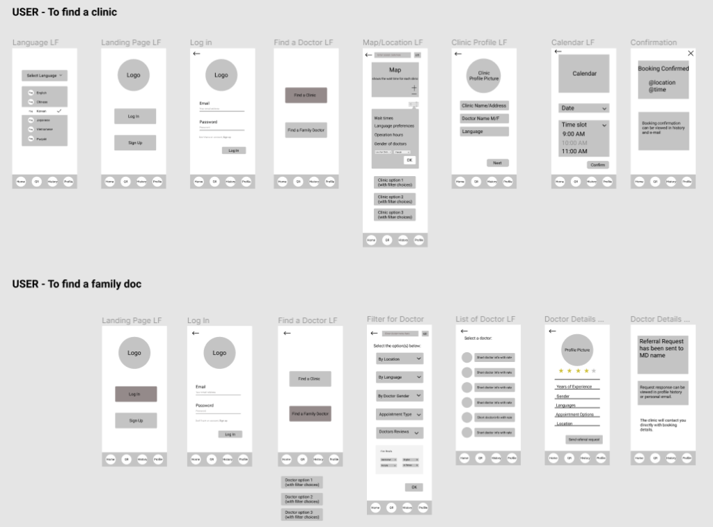
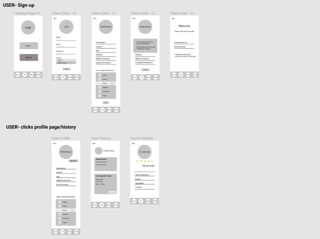
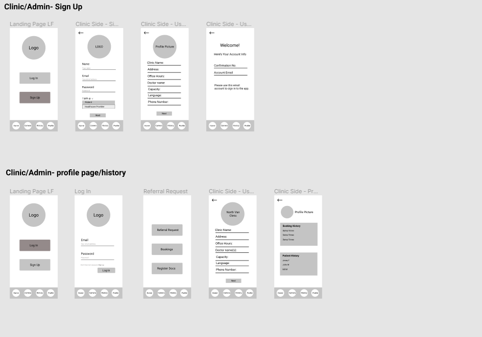
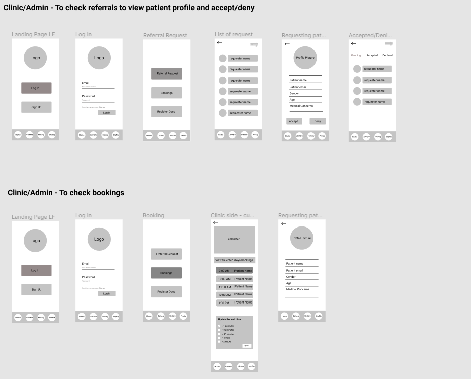
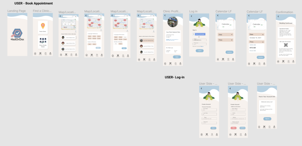
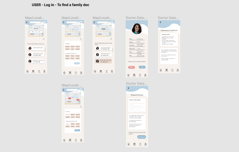
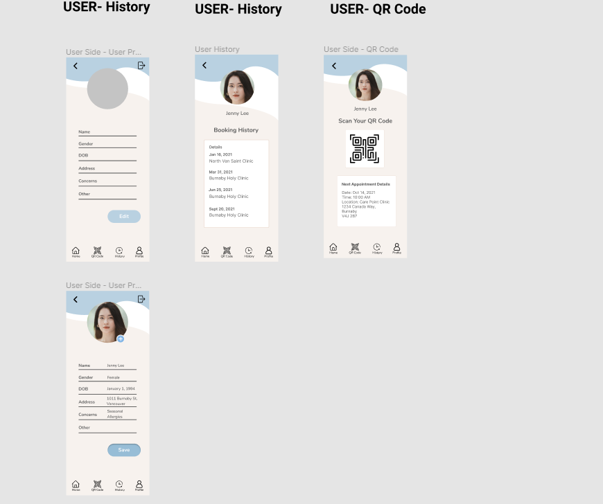
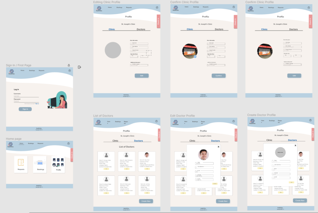
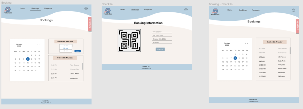
The solution is MedOrDoc. A mobile application patients can book appointments and view live wait times at clinics. They can also easily connect with family doctors that are accepting new patients and match their preferred language. The clinic side desktop app can manage their clinics live wait time, bookings and doctors profiles.
Mobile apps primary features
Appointment bookings
View wait times
Connect with and discover family doctors with your language preferences
User Research
Our initial step was to conduct user interviews to identify key issues and pain points. We interviewed four users between the ages of 18-50 years of age and varying gender.
A few of our questions:
How often do you go to a walk-in clinic?
How do you currently book an appointment for a walk-in clinic?
How long does the process typically take you from booking to completing your appointment?
What are your biggest pet peeves when visiting a walk-in clinic?
Do you have a family doctotr?
Are you aware that there are apps and websites to book with a walk-in clinic?
Discoveries:
Our main findings were that 75% of testers ages below 40 are unhappy with their current process of booking (by phone call without appointments). It was mentioned wait times are too long and booking without an app feels dated.
We also found that 50% of our testers aged below 40 do not have family doctors and would prefer to have one that speaks their native language.
Lastly, we found 25% of our testers aged above 40 had a family doctor and had no issues booking an appointment by phone call.
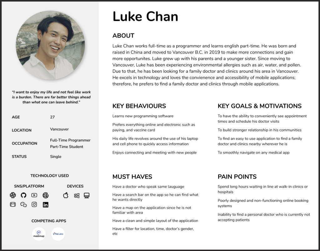
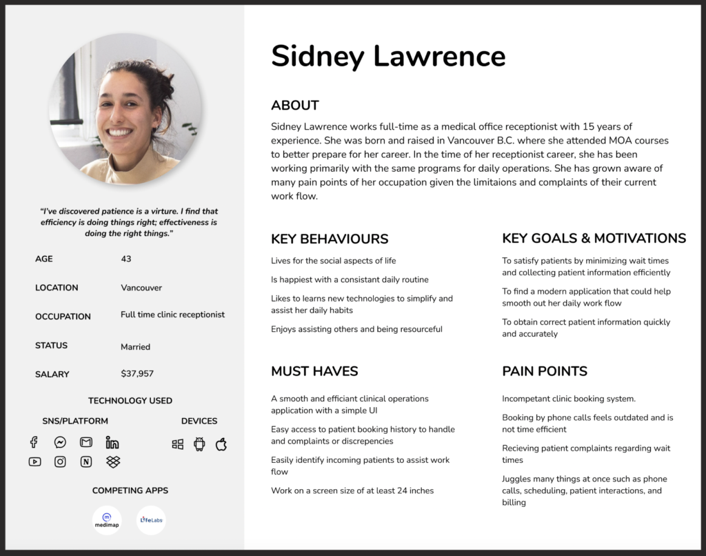
User Personas
After completing our user research, a primary and secondary persona was created based off our findings considering which users had which needs.
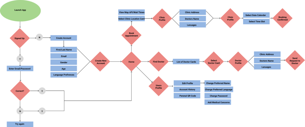
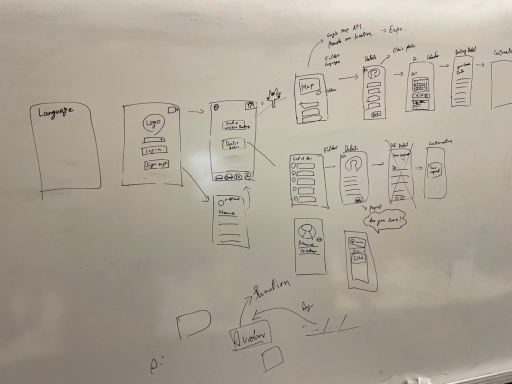
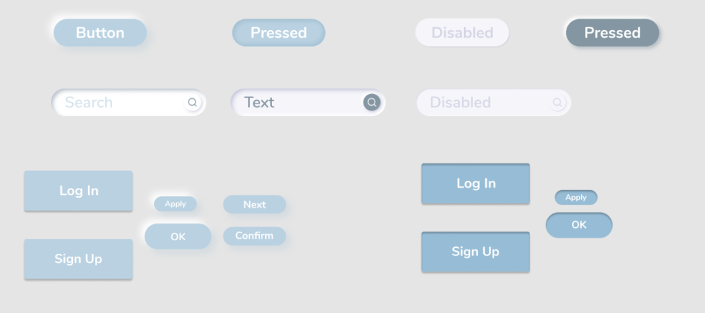
User Flow & Initial Sketches
To find the most effective navigation, I created a user flow chart. This enabled us to find the major user flows within our app and identify where navigation can be improved.
Next, we brainstormed the initial user interface and created sketches.
Low Fidelity
User Side:
Clinic Side:
Usability Testing
Once the low fidelity prototype was complete, we conducted our first round of usability testing. Our 4 testers varied in gender, education and occupation. Their age range was within 18-50 years of age. Testing was completed in approximately 45 minutes for each tester.
We conducted screening, in-test tasks and post-test questions.
A few of our questions:
How old are you? What’s your highest level of education? Which device do you usually use for completing daily tasks online?
At first look, what do you expect you can do with this application? How do you feel about the overall design?
What steps would you take to book an appointment at a clinic? What steps would you take to edit your profile?
What steps would you take to accept a booking? What steps would you take to create or edit a doctors profile?
Discoveries:
Our primary finding came from a tester who is a clinic owner. We discovered clinic workers would much prefer to handle a desktop application opposed to a mobile one. At this point, we decided to create a desktop side for clinics and mobile for users.
100% testers were able to complete our in-test tasks without guidance.
50% of testers suggested button titles to be rephrased.
50% testers were confused as to why you can filter wait times ranging from 20 minutes to 2 hours “why would I want to find a longer wait?”.