Vancity is a credit union based out of Vancouver, British Columbia. As a long time user of their mobile application, I felt that there is much room for improvement and became curious if their other users felt the same. During user surveying, it came to my attention that 50% of survey goers would not recommend this application to others. Once data was collected, I understood why users feel this way. After this, I was able to redesign the application that caters to users needs. The focus of this case study was to improve users experience in their top 3 commonly completed tasks: checking balances, paying bills and sending e-transfers.
My Role
This was an independent project. As a UX/UI Designer, I conducted the following in order:
User surveys
Card sorting
.User flow diagram
Wireframing
Usability testing on wireframe
Prototyping
Usability testing on prototype
Project Duration
2 Months
Project Tools
Figma
Google Forms
UXtweak (Card sorting tool)
Challenges I Faced
As this was an independent project, I needed to ensure I did not redesign with any bias.
As a banking application, account info is confidential. This made it challenging to conduct testing with users on the current application.
As a designer I am excited to be creative in my products. However, banking applications typically stick to a conservative design where less is more.
Solutions
To ensure I did not have any bias in my decisions or design, I conducted user surveys and usability testing to cater the best I can towards users needs.
Unable to test on the pre-existing application, I included questions in my user surveys that would be insightful to the current pain points users come across and how they feel it would improve.
To ensure my design was impactful, I researched competitors designs and discovered what was common practice for banking applications.
1. Understanding
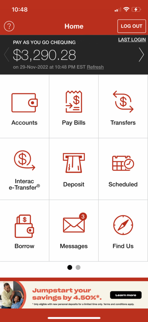
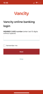
An Overview of Vancitys Current Mobile App Design
User Survey Findings
User Surveys were conducted to have an understanding of who they are, their most commonly completed tasks, what they enjoy about the application, what they don’t enjoy about he application and how they compare it to competitors products. The varied in age from 23-56 years of age, Male and Female and had a diversity in occupation and education. There were 6 participants who are current users of the app.
100% of users top 3 common tasks are checking balances, paying bills and sending e-transfers
50% of users wouldn’t recommend the app to others
55% of users prefer a competitors app
66% of users mentioned the sign in process is too long or have problems signing in
55% of users rated the interface design of the app as poor/dated.
2. Analyze
Discovering Project Scope
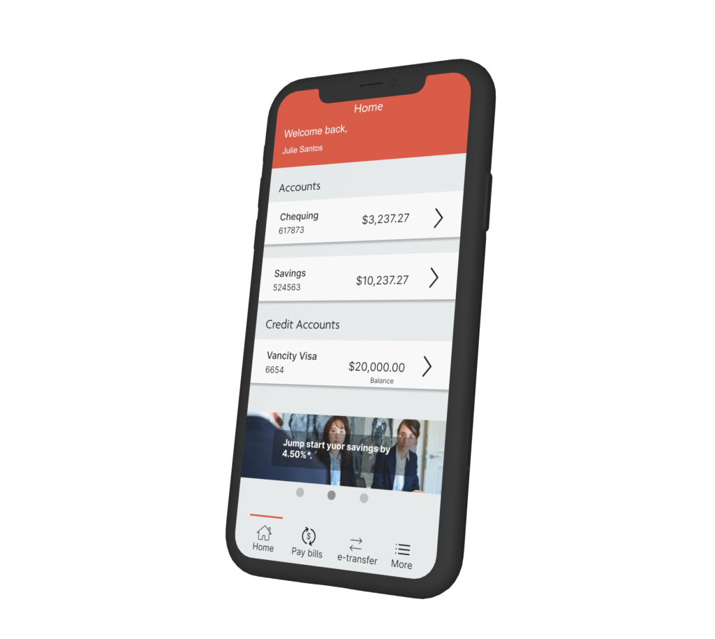
Through user research, I found 100% of users share the same top 3 tasks. For this project, I decided on focusing on these 3 tasks and improving them in a way that they are most accessible and simplistic to the user.
Analyzing Competitors
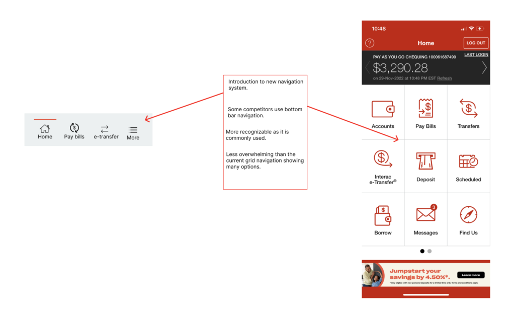
I also found that 55% of users prefer a competitors app. This called for research on competitors design and architecture. I discovered that the Vancity app does not for Jakob’s Law of UX like their competitors do. Most users spend their time on other sites, meaning they want them all to work similarly. The Vancity app did not do this by having a significantly different layout and navigation.
What does this mean for the project?
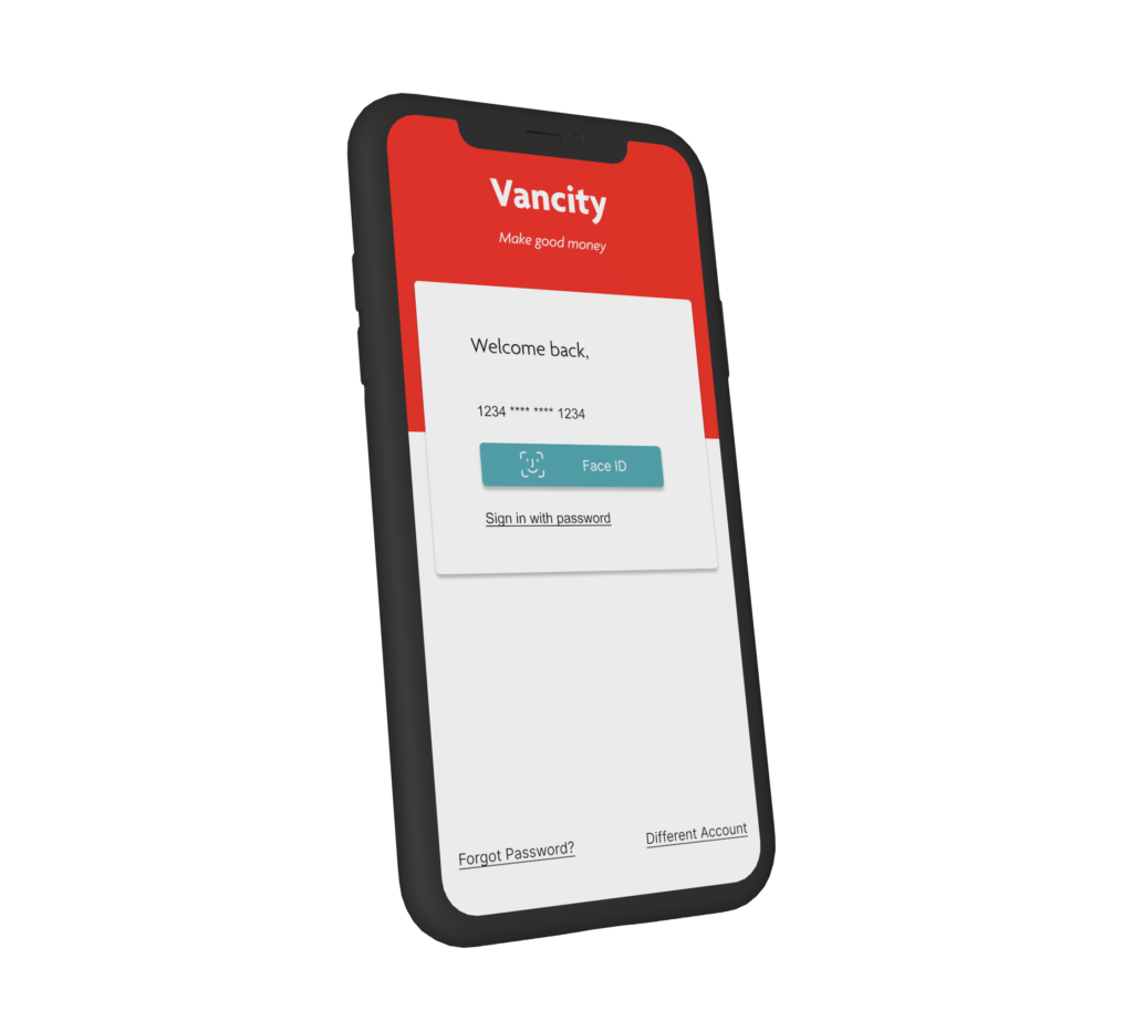
This means that I will have to redesign and adjust the navigation architecture while implementing Jakob’s Law to cater to the users needs. Starting from the sign in screen and extending to users top 3 commonly completed tasks.
To grasp an initial understanding of architecture users expect within the app redesign, I conducted an open card sorting. Open card sorting allows users to place actions they take and pages they visit into categories and then name it. I had 5 participants in the card sorting activity.
With the card sorting data, I used the Dendrogram to find the most viable merge of users choices made during sorting.
An average of 87% of users were upon agreement of card sorting arrangements.
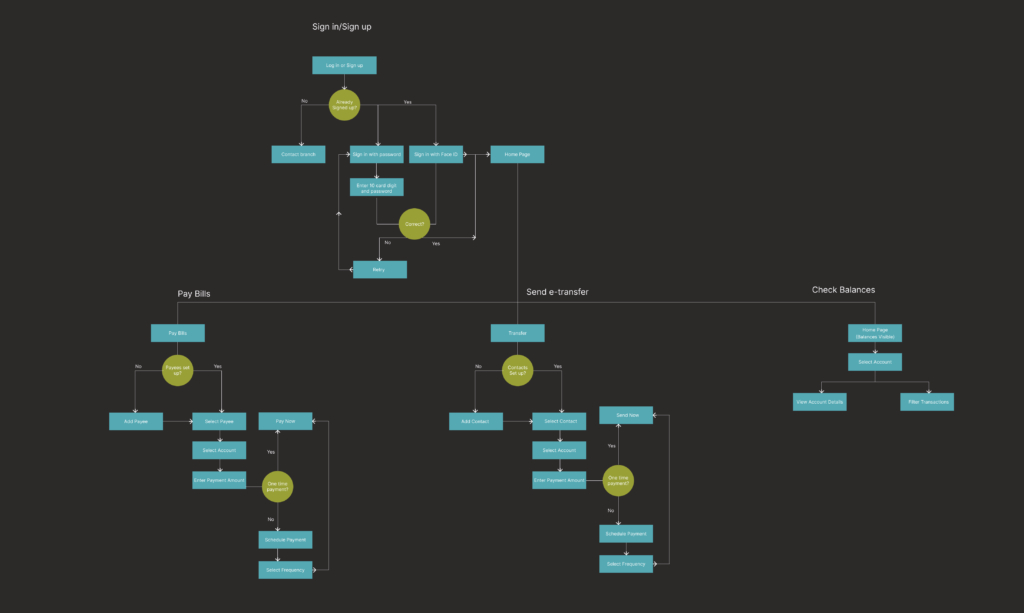
User Flow Diagram
Now that I knew how users expected tasks and pages to be categorized with a relatively strong agreement, I could translate it into a user flow diagram to ideate and visualize the path a user will take in the apps redesign.
Wireframing
With an understanding of the navigation architecture from signing in to completing the 3 most commonly completed tasks, I was ready to design the wireframe.
Interact with the Figma wireframe below or visit it on Figma:
Once the low fidelity prototype was complete, I conducted the first round of usability testing. The 4 testers varied in gender, education and occupation. Their age range was within 23-56 years of age. Testing was completed in approximately 30 minutes for each tester.
I conducted in-test tasks and post-test questions.
A few of the questions:
At first look, what do you expect you can do with this application? How do you feel about the overall design?
What steps would you take to sign in?
What steps would you take to check your chequing accounts transaction history? What steps would you take to filter the history and view that accounts details.
What steps would you take to pay a bill, schedule recurring payments, and edit a payee?
If there was anything you liked or disliked about the design, what would it be?
How difficult would you rate the tasks you were asked to complete on a scale from 1 to 5?
Discoveries:
100% of testers were able to complete the in-test tasks without guidance.
75% of testers suggested the transfer button on the navigation to be rephrased.
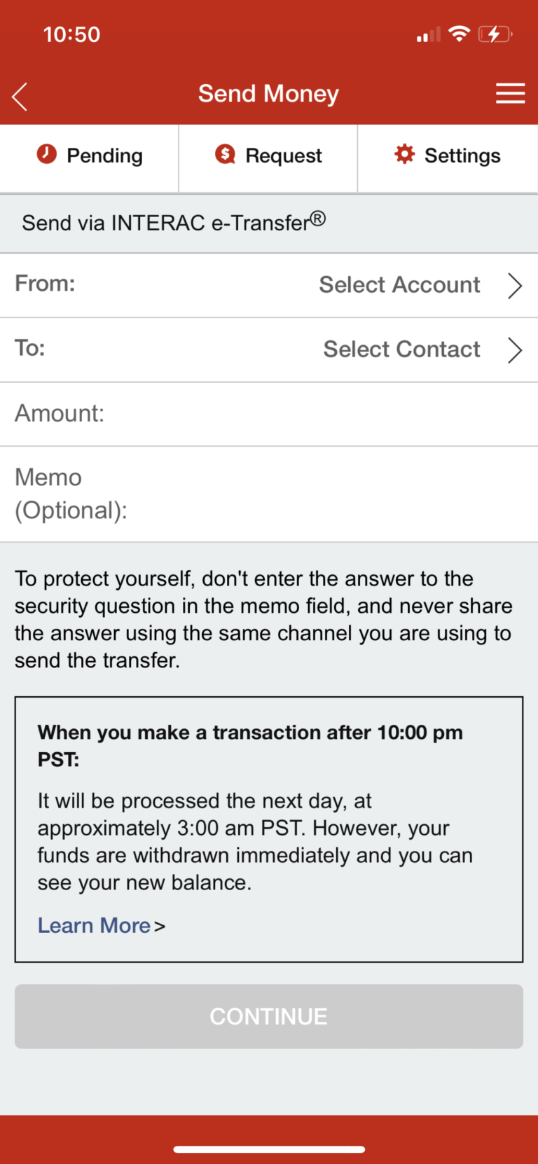
75% of testers spent a significant amount of time reading the e-transfer page. The text was overwhelming and lacked hierarchy.
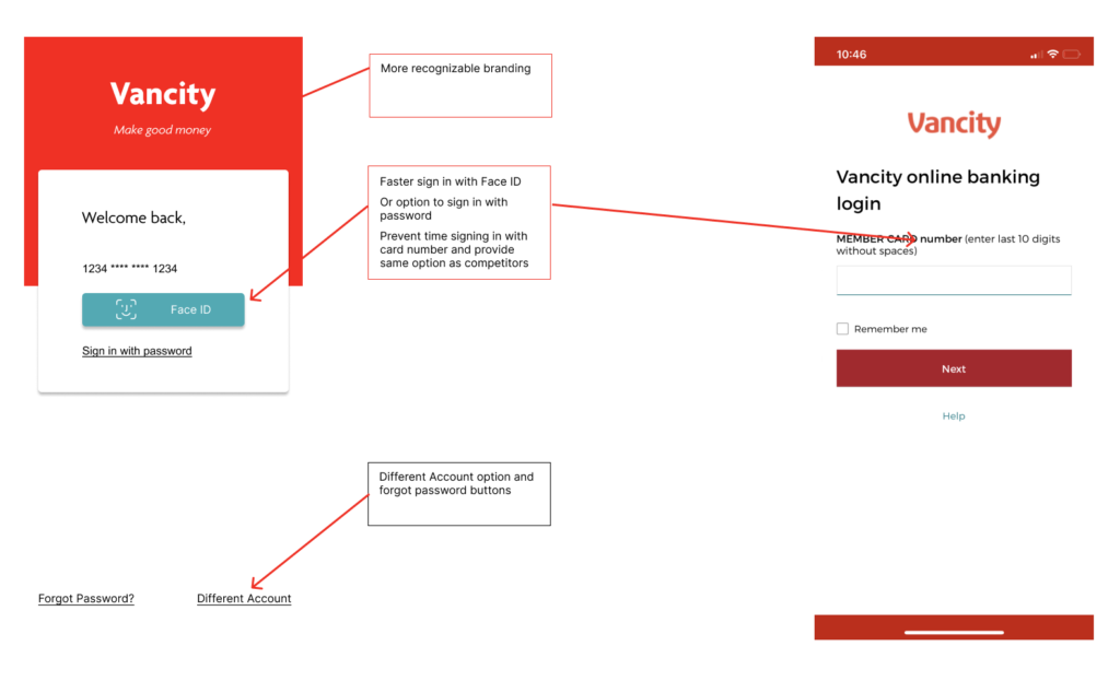
50% of users made note of a missing forgot password button on the sign in screen.
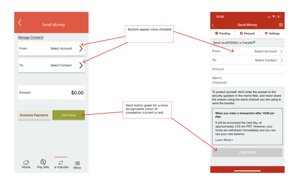
50% of users made note of what they expected to be clickable was not on the e-transfer page. Users wanted the text and adjacent arrow to be one large button.
Prototype
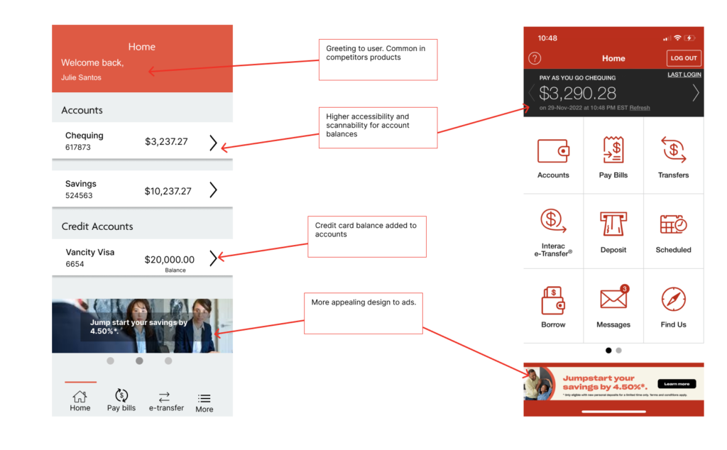
The prototype was designed with Vancity’s branding colours and fonts in mind. With the data from usability testing, the design was refined and optimized for a simple user experience and accessibility to their commonly completed tasks.
Interact with the Figma prototype below or visit it on Figma: